Looking for a business boost? There are good signs in the economy, but in a competitive market, you need great signs to attract customers to your business.
A good-looking sign is just the start: by taking care of a few considerations, good signs become great signs. Great signage shows professionalism, and credibility and helps do your selling for you.
We’ve designed a handy mnemonic with the word ‘signage’ (a word pattern which helps you remember things) encapsulating everything required to get the most from your branding and signage.
S – Strategic (From design to placement)
Good signs don’t happen by accident! Careful planning starts with the design and layout of your sign. It should be bold, bright, and to the point, catching the eye and stirring the soul. Looking good? Let’s get it where people can see it clearly. And by people, we mean the right people: your sign should go where your customers or potential customers are. We’ll help with all of that, of course!
I – Impression (Does it leave one on your customers?)
We all know how hard it is to impress Shania Twain, even if you’re Brad Pitt, but this is the challenge for your signs: you want cut-through. Generally, making an impression is a split-second thing. Lengthy text or complicated concepts probably aren’t the best. Something clever and direct often is…
G – Generate (Bring in new customers?)
Something direct and creative is what you’re after, but first, consider the purpose of your sign. Is it advertising? Is it educational? Does it help with directions? Does it generate foot traffic by bringing your customers in? Having a clear idea of the intention and purpose of your sign always delivers a better result. Having a plan means getting the job done right!
N – Noticeable (Do people notice it?)
Signs are so super effective, they’re everywhere. This means your sign should be something a bit special. It shouldn’t ‘catch’ the eye, it should outright go and grab the eye! Effectiveness here depends on a great look for the sign itself…and then the very best placement so the people whose eyes you want can’t miss it.
A – Action (What’s the call to action?)
Marketers often insist most communications end with a ‘call to action’. Your sign should have one too. Do you want an email? A visit to your website? A phone call? A visit to your premises? This should be clear to your audience. Make sure numbers, URLs and email addresses are simple and memorable – a complicated, lengthy web address doesn’t make any impression and is easily forgotten.
G – Grow (Can it grow with you? Fleet/new buildings?)
You want the best results from your investment, and this depends on making signs that last. No good replacing them every 6 months, or if your business takes a new direction. Look for designs and messaging which stand the test of time – so the only maintenance your signs need is the occasional clean and tidy.
E – Exclusive (Is it unique enough or like others?)
Your sign is all about YOU and your business. While there’s a case to be made for imitation (which is, apparently, the best form of flattery) don’t be surprised if McD’s lawyers come a-calling if you come up with the golden arches for your restaurant. Look for exclusivity in design, colours, and words – so your signs are unequivocally yours. That’s a key part of building a brand…and ensuring that what you put out there today, is just as good tomorrow. And the day after that.
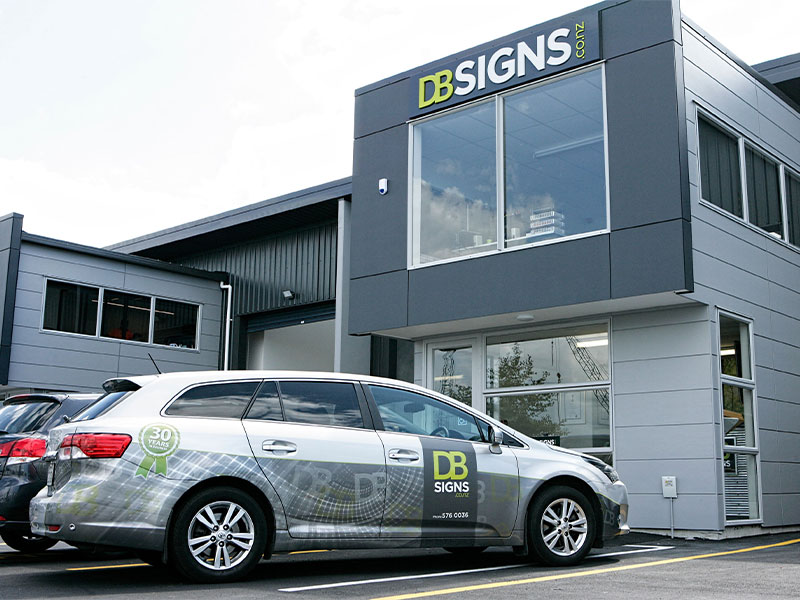
SIGNAGE – that’s the mnemonic we’ve put together in this blog, and signage is also what we’re all about at DB Signs. Do call in and see what we can do for you. Hope to see you soon!
