Why you should never skimp on quality signage
Whether starting a new business or even when it’s just business as usual, whether good economic times or bad, the one area where corners really shouldn’t be cut is the signage. After all, when you hang your shingle out, passers-by, the general public and of course the folks specifically looking for your company all get an immediate impression from the quality of signage carrying your business name. If it is tatty, faded, and lifeless, chances are they’ll make all the wrong associations and just drive right on by.
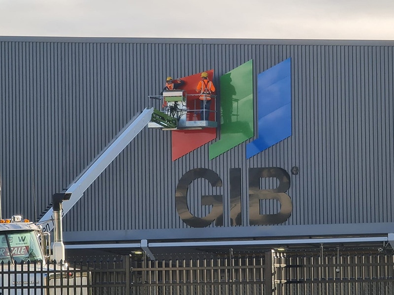
Signage, of course, is anything from wall signs, sandwich boards, banners, window displays, billboards, vehicle wraps and plenty more.
1. Branding
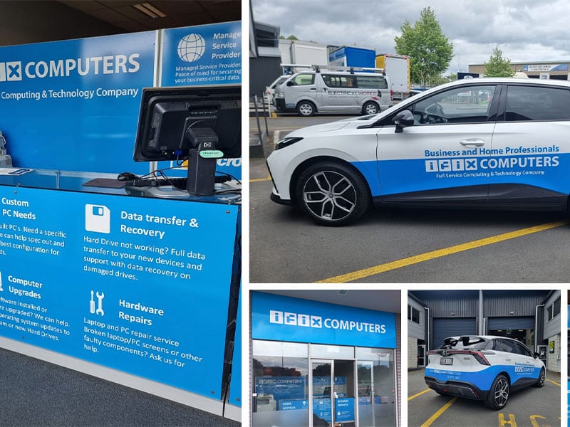
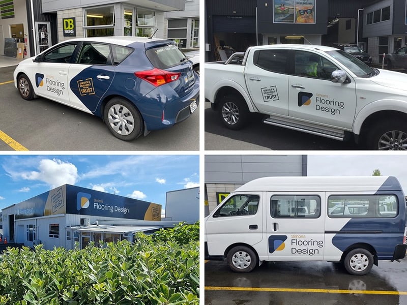
Everyone loves a good brand, and good brands are memorable. Coca-Cola, Google, Amazon – these are examples of billion-dollar brands instantly recognisable everywhere. Now, nobody’s expecting you to establish a brand of this magnitude (although, as Xero has shown, good old Kiwi ingenuity can lead to the world stage!), but you should take your cues from these and other successful brands. What they have in common is a bold logo, consistent attributes like colours and font, backed by consistent values. For your signage, having a clean, bold brand is the start of creating an expectation in the minds of your customers. Consistency across every place the brand appears is crucial, as is presenting it with respect. Your signs, in other words, represent your business. They should be clean, neat and easy-to-read. And remember, a good brand reflects your business – using Comic Sans, for example, might work well for escape rooms, but would give entirely the wrong impression for a doctor’s surgery.
2. Effective communication
Easy-to-read? And easy-to-understand. Overly-busy signage can confuse your audience, especially if they are driving by or even walking by. Less is more – you want memorable signage that gets the message across fast and effectively. Including contact details is always a good idea; phone numbers can be hard to remember, so a simple email address – hello@mybusiness.com – is often effective, as is a web address, particularly if the URL is simple (always try go with the name of your business for the URL). Sometimes, saying it plainly says it best of all; where humour is concerned, tread carefully. Not everyone has the same funnybones as you do, and in today’s age discretion is often the safest option. Colours, too, play a role in effective communication. Contrast is the first consideration; high contrast is easier to see. Colours convey implicit meaning, too – red for passion or anger, blue for calm, yellow for friendship. Consider these elements for your brand and for your signage.
3. Physical location (and physical condition)
Once you have a great brand and clear message established (and you know that’s what you can expect from DB Signs!), consider where you’re going to put them. Aside from the obvious – outside your premises, where you’ll alert everyone to your presence – there are plenty of additional placements where you can amplify your message. These placements aren’t only physical – put your signs on your social media pages (if appropriate) and even consider using them as part of a campaign, whether online or in the local newspaper. Both these options- the web and the local rag – are highly effective in reaching local audiences, making them well worth exploring.
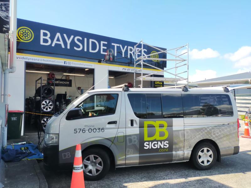
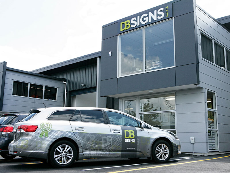
Then consider branding your car with a wrap, or perhaps a billboard on the main drag. Getting your message out using signs is invaluable; for many businesses, doing the work isn’t the hard part. Finding the work is. And great signs capture the eyes of your customers, alerting them to what you do, and bringing them to your website, phone, and ultimately, front door.
A last word on signs. It is remarkable how quickly something brand new and sparkly can wind up tatty and derelict. Think of your signage as your home or care. When tidy, clean and presentable, it gives a great impression. If it’s rundown, peeling and dirty, quite the opposite. Wherever you have signage, try looking at it as if you’ve never seen it before (because as the old saying goes, familiarity breeds contempt…or you’re seeing it every day, the slow deterioration might become invisible).
Keen to update your signs? Get in touch – we’re always happy to hear from you!